Discount Mart Sales Analytics Dashboard
Project Overview
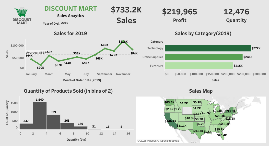
Discount Mart required a consolidated performance tracking framework to evaluate organizational sales metrics, profitability, and customer purchasing patterns across multiple operational years (2016–2020). Built in Tableau, the Sales Analytics dashboard centralizes revenue data into an interactive, single-page executive interface, allowing decision-makers to analyze multi-year growth, regional performance, and product category trends.
Challenges
The organization sought clear data insights to answer several core operational questions: Multi-Year Performance Tracking: Difficulty evaluating organizational growth in terms of total sales revenue, overall net profit, and product unit quantities on an annual and monthly basis. Category & Regional Visibility: Lack of granular visibility into how specific product lines (Technology, Furniture, Office Supplies) and geographic territories performed relative to one another. Profit Margin Analysis: Need to verify if profitability targets (specifically testing if net profit met the 30% margin benchmark relative to total sales) were being achieved. Customer Purchasing Patterns: Inability to measure product volume frequency per order to understand how many units individual customers typically buy.
Solution
A multi-tiered Tableau dashboard was designed and deployed to deliver real-time data analysis: Executive KPI Scorecards: Built prominent high-level indicators showcasing total sales ($2,297.2K), total net profit ($689,160), and total unit volume sold (37,873). Time-Series Revenue Trend: Formatted a monthly sales trend line spanning 2016 through 2020 to reveal seasonal peaks, annual growth trajectories, and baseline averages. Product Category Breakdown: Implemented horizontal bar charts highlighting sales by category—pinpointing Technology ($836K), Furniture ($742K), and Office Supplies ($719K). Geographic Sales Map: Integrated an interactive US regional map showcasing revenue density across states to identify key geographic markets. Quantity Distribution Histogram: Binned product quantities into groupings of 2 to analyze order volume frequency per customer transaction. Cloud Dashboard Deployment: Published the interactive dashboard to Tableau Public for seamless sharing, filtering, and cross-functional reporting.
Results
Results The solution provided actionable business insights and verified key operational benchmarks: ✓ $2.297M Total Sales Tracked: Provided complete clarity into overall sales performance across all fiscal years and product lines. ✓ 30% Profit Target Confirmed: Validated that total net profit ($689,160) successfully achieved the 30% margin threshold relative to total revenue ($2,297.2K). ✓ Top Category Identification: Highlighted Technology ($836K) as the primary revenue generator, followed closely by Furniture ($742K) and Office Supplies ($719K). ✓ Binned Order Volume Insights: Identified that the majority of orders fall within the 2–4 unit range, aiding inventory forecasting and volume packaging strategies.